• About Us
  • L'EAU-ASE
  • IMPACT
  • DDNA
  • Vision in Blue
  • The Marigold House
  • Het Molenhuis
  • Contact us
  • Art House
  • The Powerof Color
  • The New Style Office
  • A Dream in Pink
  • Green Oasis Kitchen

The Power
⸺ of Color

BRANDING

STRATEGY

VISUAL IDENTITY

Project Information

Client Zeilschool de Kikkert

"A week they will never forget", the owner of sailing school de Kikkert joyfully replied when we asked him about the experience kids have during the summer camps. Days on the water, nights at the disco and friendships for life. Spending time at sailing school de kikkert feels like an explosion of playfulness, vibrance and fun and needs a bold graphic identity to match.

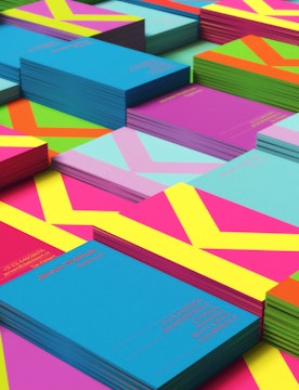
The graphic identity combines a bold multi coloured palette with strong angular shapes, capturing the use of colour on sails within water sports in a fresh and energetic way. The capital K logo and clean typography anchor the brand and creates opportunity for playful graphic styles and bold colours to show real personality.

To top it off we created a small line of merchandise products that captures the spirit of the kikkert so kids could take home something tangible, filled with those newly made memories.